

We live in a world full of colors. Be aware or not, these colors have both positive and negative meanings deep inside of our brains. Some brands utilize them well, while some fail. That’s why designers study color theory. Understanding these effects is key to creating strong bonds with brand’s identity.
While creating your brand, you’ll need to decide your brand’s characteristics. This is a brief article about color theory. Reading it will give you to a better understanding of meanings of colors, preferences by genders and some solid logo examples to see how major brands utilize color.

Red

Our brains associate red with love, passion, power, strength, heat, desire, and speed. Red, also has negative meanings like anger, danger, and warning. It’s great to use red for brands that evoke passion.
Red is commonly seen and used in advertising, fast food industry, sports, entertainment, and health care.
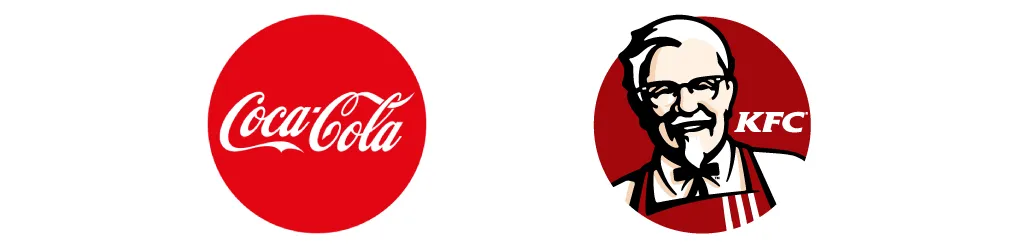
Some well known red brands are: Vodafone, Canon, Nintendo, CNN, Nintendo, Coca-Cola, KFC

Orange
As the combination of red and yellow, orange evokes energy and vibrancy. It is also friendly and inviting. Using orange is a great way to show high-energy. And it is the fifth most common color used in logos of major brands. But, it’s also the second least favorite color of women and one of the second least favorite of men.
Our brains associate orange with warmness, energy, happiness, fun, cheerfulness, flamboyance, confidence, and friendliness. Orange, also has negative meanings such as ignorance and, sluggishness. Orange is thought to stimulate appetite. Also, it’s known that people think that orange has a cheap feeling.
Orange is and used by retail industry, brands that focus on children, food and beverages industry. It’s also used on sporting events and board games.
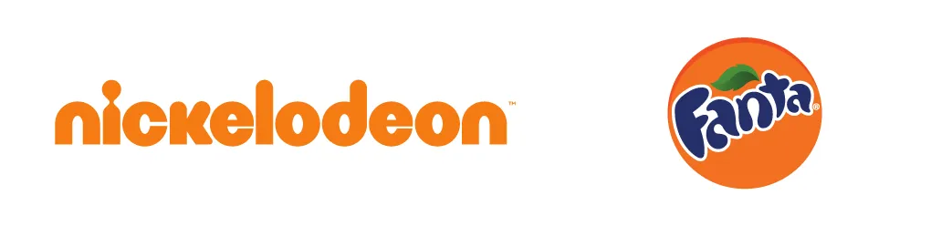
Some well known orange brands are: Nickelodeon, Orange, VLC, Fanta, TNT, Mozilla Firefox, Harley Davidson

Yellow (and Gold)
The color of the Sun, yellow, shines bright with optimism! It’s the most luminous of all the colors of the spectrum. Maybe that’s why yellow captures our attention more than any other color. Yellow is also the first color infants respond to. It is the third most common color used in logos of major brands.
Our brains associate yellow with brightness, warmth, being energetic, happiness, joy, and positivity. Yellow, also has negative meanings like irresponsibility, being unstable, deceit, cowardice, and hazard.

But when we think about gold, yellow’s all light atmosphere turns into a heavy one. Our brains associate gold with wealth, prosperity, value, being traditional, being egotistical, and self-righteousness.
Yellow is the color of caution and physical illness. Perhaps it’s no coincidence that the sources of yellow pigments are toxic metals like cadmium, lead, and chrome; urine is yellow too.
Yellow is commonly seen and used by traffic crossings and signs, taxis, brands that focus on children, food and beverages industry and restaurants. It is also used on smiley faces and has an important role in marketing.
Some well known yellow brands are: Shell, Best Buy, DHL, Post-it, McDonald’s, Chupa Chups, National Geographic, Nikon, IKEA

Green
Green is the color of Mother Nature. It’s one of the most frequently seen colors in nature; plants mostly have the tones of green. After blue, green is the second favorite color of both genders. And it is the sixth most common color used in logos of major brands.
Our brains associate green with nature, freshness, environmental, newness, money, fertility, healing, and earthiness. Green, also has negative meanings like envy and jealousy. But overall, it has more positive effect than most other colors.
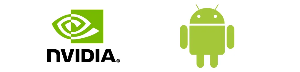

Some well known green brands are: Whole Foods, BP, Girl Scouts, Animal Planet, John Deere, Carlsberg, Heineken, Nvidia, Android, Whatsapp, Evernote, deviantART

Blue
We are surrounded by a blue sky. Our planet is known as the “Pale Blue Dot”. Maybe that’s why the color blue is almost every men’s and women’s favorite color around the globe. Blue is the most common color used in logos of major brands too. You can find blue, on more than 35% of major brand logos.
Our brains associate blue with tranquility, security, integrity, peacefulness, loyalty, trust, intelligence, and professionality. Different tones blue can have different meanings. For example, turquoise is associated with sophistication and spirituality. Blue, also has negative meanings like coldness and fear.
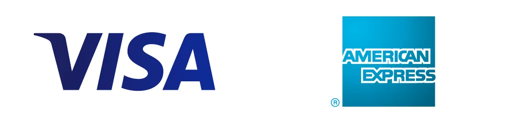

Some well known blue brands are: facebook, twitter, Intel, Skype, Paypal, IBM, HP, IBM, Nokia, General Electric, Samsung, EA, American Express, Allianz

Purple
Purple is a magical color that evokes serenity and artistry. It possesses the energy and power of red, with the stability and reliability of blue: a perfect balance between the physical and spiritual. Purple is the second most favorite color of women. Purple is one of the second least favorite colors of men.
Our brains associate purple with; royalty, nobility, spirituality, luxury, ambition, wealth, creativity, mystery and majesty. Purple, also has negative meanings like moodiness, arrogance, gaudiness, profanity, and inferiority. Purple once was the most expensive color to produce, thus often viewed as “elitist”. Darker shades of purple are great for luxury brands and products. Lighter shades are better for products that are targeting women, because of their femininity.
Despite all the majesticity of purple, there are not many major brands that choose purple as their main color. Purple is the seventh most common color used in logos of major brands. That means less than 5% of major brands use it as their main logo color.
Purple is commonly seen and used by luxury products, magic shows, astrology, massage centers, beauty products targeting women, toy and candy packaging.
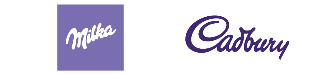
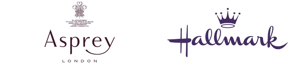
Some well known purple brands are: Yahoo!, Milka, Cadbury, twitch, Wonka, Syfy, Asprey, BenQ, Hallmark

Pink
Pink is a softer, less intense version of red that creates a sense of compassion and unconditional love. It is generally considered as a feminine color. And it’s the unofficial color of cancer awareness — especially the breast cancer.
Our brains associate pink with being healthy, happiness, being feminine, sweetness, compassion, playfulness, softness, gentleness, beauty, and sympathy. Pink also has negative meanings like weakness, immaturity, and inhibition. Bright and vibrant tints of pink can be used to evoke a bold and modern appeal.
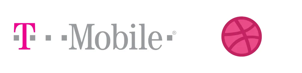
Some well known pink brands are: Barbie, Cosmopolitan, dribbble, T-Mobile, InVision, Bright Pink

Brown (and Tan)
The color of the soil, brown, is not everyone’s favorite color. It is the least favorite color of men and second least favorite color of women.
Our brains associate brown with friendliness, earthiness, outdoors, longevity, reliability, nature, being traditional, and dependability. Brown, also has negative meanings such as being dogmatic, being conservative, and being dull.

Some well known brown brands are: UPS, Hershey’s, Gloria Jean’s Coffee, M&M’s, Cornetto, Nespresso

Black
Black evokes timeless and bold appeal. It has a special place when designing logos: Logos are designed in black/white first and they should be able to work as black only art. After blue, black is the second most common color in logos of major brands. Black is the third most favorite color of men and the fifth favorite of women.
Our brains associate black with protection, elegance, being classy, formality, boldness, mystery, being powerful, sophistication, glamor and high quality. Black, also has negative meanings like death, evil, terror, fear, oppressiveness, and mourning.

Black is commonly seen and used by high-end brands, professional attires, luxury products, financial firms, and corporation.
Some well known black brands are: Apple, Chanel, Louis Vuitton, Gucci, Adidas, Nike, BlackBerry

Gray (and Silver)
Gray is a neutral color which sits between the extremes of black and white. Light grays can be used in place of white in some designs, while dark grays can be used in place of black. Gray is not a popular color among both genders. Only a small percentage of men and women consider it as their favorite color.
Our brains associate gray with security, reliability, intelligence, solidity, modernity, futuristic, neutrality, calmness, and openness. Gray, also has negative meanings like gloominess, sadness, being conservative, and moodiness. And more metallic tones of the gray mean glamor, high-tech, gracefulness, sleek, indecisiveness and being dull.

Gray is commonly seen and used by modern technology companies, conservative corporate settings, automotive industry, and sleek design.
Some well known gray brands are: Swarovski, Wikipedia, Lexus

White
The Web is full of white spaces. But it’s impossible to create a mono-white logo. White is a secondary color that you can match with any other color. That’s why you can find white in logos as reversed texts or negative spaces.
Our brains associate white with goodness, innocence, purity, cleanness, light, being pristine, simplicity, and virtue. After blue, white is the most trustworthy color to eyes of people. White also has negative meanings like isolation and emptiness.
White is commonly seen and used by wedding industry and doctor’s offices. It is also used in website backgrounds and as reversed texts or negative spaces in logos.
Conculsion
Now you should have some idea about which color fits your brand’s identity better and which color is not right for it. But, remember: Color meanings can change over time and location. For that reason, the meaning of colors and what they mean to a specific gender, age group or area of the world your brand is targeting, should be taken into consideration.