
Logo Redesign and Business Card
ikie Mühendislik
As an engineering firm which is really active in the construction industry, ikie Mühendislik now has the logo they needed to show the quality of work they produce.

About ikie Mühendislik
The Challenge & Solution
ikie Mühendislik, was not happy with their current logo which did not reflect their industry and their brand. Using our expertise in branding, we have created a modern and professional logo that represents their brand.
Logo Design
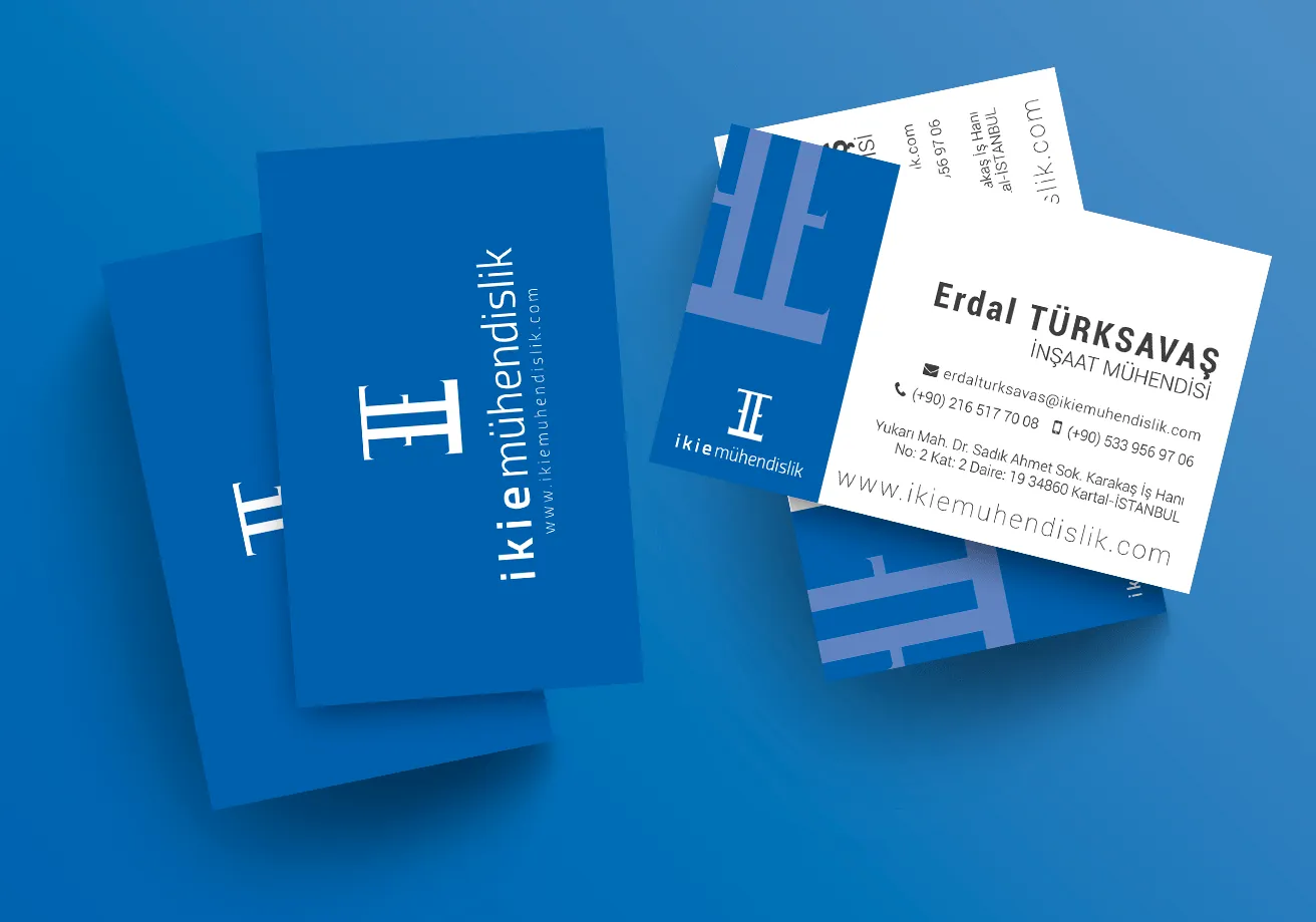
ikie Mühendislik translates to twoe Engineering in English, twoe being the 2 E’s which are the first letter of 2 co-owners of the company. While creating the logo, we wanted it to reflect this as much as construction, which is the industry they actively work in. With two E’s that leaning on each other’s backs, which also forms the number two in Roman language, also represents the frame of a building that’s being constructed.
Colors
Considering their industry with their professional services, we decided to go with blue tones to represent ikie Mühendislik.

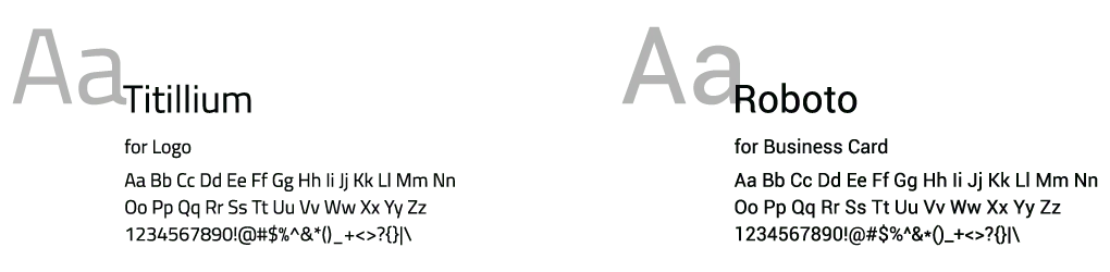
Fonts
To soften the logo’s classic look and create a more modern feeling, we decided on Titillium and Roboto as main fonts.
Business Card Design
We wanted to mix modern and classics while designing the business card for ikie Mühendislik. This allowed them to have a business card that lines with the expectation of the industry while showing the quality of ikie Mühendislik with a modern look.
Outcome
With the rebranding, ikie Mühendislik now has a modern brand that better represents them. With their new business cards, they already started getting more leads.
Testimonial
With the rebranding, ikie Mühendislik now has a modern brand that better represents them. With their new business cards, they already started getting more leads.