

Your brand color is the first thing someone processes. Before they read a word.
Peer-reviewed research by Sillence et al. found that 94% of website rejection is design-driven. Color was specifically named as a trigger. Not your pricing page. Not your feature list. The visual impression you make in the first second.
Most SaaS founders treat color as a late-stage branding decision. Pick something that looks good, match it to the logo, move on. But the companies that get this right treat color as a strategic signal. They ask: what do we want people to feel the moment they land here? And they build from that answer outward.
This post walks through how to do that. Not the theory. The actual decisions.
Why Color Is Your First Trust Signal
Color works before your words do. It sets the emotional context your copy has to work within. Get the color wrong and your messaging fights an uphill battle. Get it right and everything else becomes easier.
The Edelman 2019 Trust Barometer found that 81% of consumers say brand trust is a deal breaker in purchasing decisions. For SaaS companies selling on annual contracts, trust is not a nice-to-have. It’s the cost of entry. And your color palette starts building or destroying that trust before anyone reads a single claim you make.
Here’s what the research actually says about color and trust: Su, Cui, and Walsh published three experimental studies in the Journal of Marketing Theory and Practice in 2019, finding that blue consistently increases consumer trust relative to red. Not by a specific percentage. The finding is directional. Blue reads as trustworthy. Red reads as urgent, even alarming. That’s why you see so much blue in finance, healthcare, and enterprise SaaS.
Here’s what’s actually happening: your brain decides whether a new company feels safe in the first second of looking at their site. Not after reading the pricing page. Not after reading the features list. In the first second. Colors your brain recognizes as stable and familiar push that threat response down and open you up to what the company is actually saying. Colors that feel off or jarring do the opposite. The content doesn’t get a fair read because the brain hasn’t finished its safety check.
This is your first trust signal. Use it deliberately.
What Your Competitors’ Colors Are Already Saying
Before you decide what colors to use, look at what your competitors are already using. Your brand color doesn’t exist in a vacuum. As part of your visual identity, it exists in a market context.
Adobe’s Color Psychology research found that 54% of consumers say blue is the most trusted brand color. The market has noticed. In SaaS specifically, the concentration is even higher. Open ten SaaS websites. Count the blue ones.
Here’s a quick scan of what the SaaS landscape actually looks like:

Salesforce reads as trust, enterprise reliability. Their blue system anchors the enterprise signal that’s made them the default CRM expectation.
HubSpot (#FF4800) stands out immediately in a sea of blue competitors. It reads as bold and high-energy. Whether intentional or not, the contrast effect is real: when everyone around you is blue, a vivid red-orange gets noticed.
Stripe (#533AFD) straddles blue and purple. It reads as technical sophistication. Developer-first, slightly experimental. The tone is confident but not corporate.
Shopify (#95BF47, a commerce green) signals growth and commerce. It sits in contrast to enterprise blue and reads warmer.
What this tells you is not which color to choose. It tells you what each position in the market already looks like. If you’re entering a category dominated by navy and cobalt, choosing a different color isn’t a risk. It’s one of the few visual differentiators available to you.
The question to ask before you pick anything: if someone saw your brand color and your three closest competitors side by side, would yours tell a different story? Or would it blend in?
What Each Color Communicates
Color psychology is a real field with a real body of research. It’s also one of the most myth-ridden corners of marketing. Here’s what you can actually say about colors in a SaaS context.

Blue is the dominant SaaS color for a reason. Trust, stability, reliability. Salesforce is the clearest example: enterprise credibility expressed through a consistent blue system. Blue is the rational choice when your buyers need to feel safe handing you their data and their money.
Green sits at the intersection of growth, commerce, and health. Shopify (#95BF47) leans into this naturally as a platform built around selling. Green also has positive associations with permission and forward movement, which suits platforms and marketplaces.
Purple and Indigo carry complexity and creativity. Slack’s aubergine (#4A154B) is a distinctive brand anchor. Stripe’s #533AFD pulls purple toward blue, keeping the technical credibility while adding personality. Linear’s dark indigo takes a similar path: technical precision with a color that reads as thoughtful rather than corporate. Purple differentiates in a blue-dominated landscape without abandoning the trust signal entirely.
Orange and Red-Orange signal energy, boldness, and forward momentum. HubSpot (#FF4800) uses this effectively as a counterpoint to CRM competitors that skew cold and enterprise. The risk with orange is that it can feel low-stakes or consumer-grade if not balanced carefully.
Black and Neutral palettes, like Notion’s, read as sophisticated, minimal, and timeless. The risk is also the benefit: they’re distinctive precisely because they opt out of the color conversation. This works when your product positioning is built around clarity and calm.
Multi-color systems like Figma’s five-color palette and Canva’s turquoise (#00C4CC) and purple (#7D2AE8) pairing signal creativity, playfulness, and range. They work when the product is itself a creative tool, because the brand signals what the product enables.
A note on cultural context: if your SaaS operates in multiple countries, color associations shift by region. White reads as purity in Western markets and mourning in some Asian markets. For most US and global English-speaking SaaS companies, these color psychology associations are the right starting point. But if you’re building for a specific regional market, verify before you commit.
Why Every SaaS Brand Reaches for Blue (and When to Resist)
Blue is the safe choice. And safe is not the same as right.
The research is clear: blue increases trust. And the market has responded accordingly. In SaaS, the concentration is heavy in enterprise software, security, analytics, and infrastructure. If you’re building in those categories, blue makes sense. Your buyers expect it, and meeting that expectation lowers friction.
But here’s the problem. When every company in your category uses a variation of blue, the color stops differentiating anyone. It becomes the category default. The background noise. You’re not signaling trust anymore. You’re signaling: we look like everyone else.
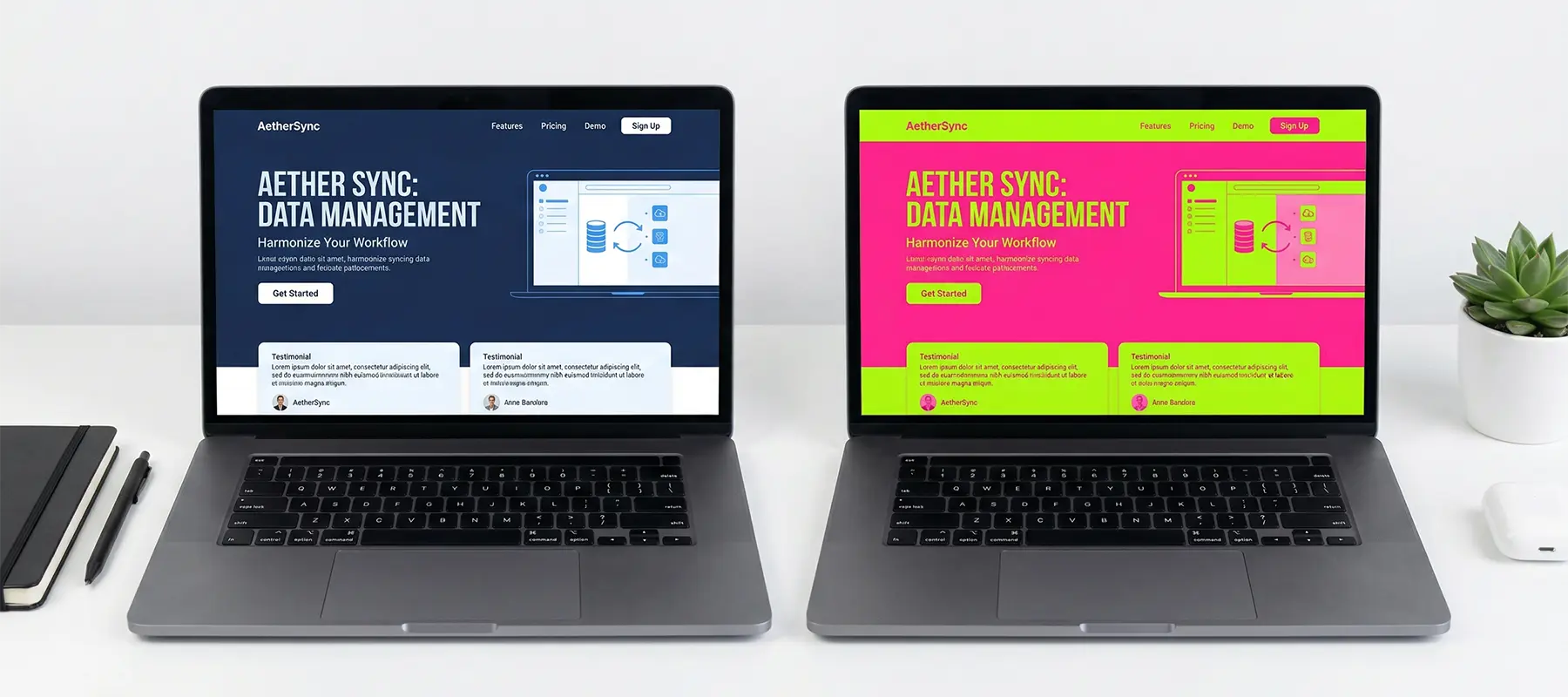
The most instructive case study in the SaaS space is Slack’s 2019 rebrand, designed by Pentagram. Their original logo used 11 colors. In Pentagram’s own case study, they noted it “suffered against any background other than white.” The new identity reduced the palette significantly, building around an aubergine anchor (#4A154B) that was, in their words, “instantly recognizable against the white of other desktop windows.”

Slack didn’t choose aubergine because purple is inherently better than blue. They chose it because it worked in the specific visual environment where Slack lives: a white desktop screen surrounded by other apps. The differentiating insight was environmental. Where does your brand actually appear, and what does it need to do there?
This is the question most SaaS companies skip when choosing colors. They think about the brand presentation, the website, the marketing materials. They don’t think about the desktop taskbar, the browser tab, the notification icon, the email preview. Slack thought about all of those. That’s why the aubergine works.
The takeaway: blue is not wrong. But in startup branding, choosing blue because “it conveys trust” without asking whether it differentiates you in your specific market is how you end up invisible.
Matching Color to Your Brand Personality
Before you open a color picker, you need to answer a positioning question: what does your brand actually stand for, and who are you standing next to?
This is not a philosophical exercise. It’s a practical filter. Your brand’s personality determines which colors are even available to you. Start with these questions:
What is your buyers’ primary emotional need when evaluating you? Security and reliability? Efficiency and speed? Creativity and range? Innovation and technical edge? The answer points toward a color family. Security and reliability point toward blue. Creativity and range point toward multi-color or purple. Speed and efficiency often read well in clean, high-contrast palettes.
What do your three closest competitors look like visually? Audit their primary color, their secondary color, and the overall emotional tone of their site. This is your differentiation map. Where is there white space?
What stage is your buyer in? Early-stage founders evaluating ten tools are scanning fast. Color contrast and distinctiveness matter more. Enterprise buyers in longer evaluation cycles give more weight to the gravity and stability a color signals.

Here’s what we’ve noticed working with SaaS companies and startups: the ones who struggle most with color decisions are the ones who haven’t answered the positioning question first. They’re trying to pick a color before they know what they’re trying to communicate. The color becomes the brand, instead of the brand informing the color.
Most companies do this: they pick a color they like, then reverse-engineer a rationale. The ones who end up with cohesive, effective brand systems do the opposite. They define the emotional territory they want to own, audit who owns what in their market, identify the gap, and then choose a color that fills it.
Take a hypothetical project management SaaS entering a market dominated by Asana’s coral-pink and Monday’s multicolor system. The audit shows two things: every competitor is leaning warm and energetic, and the buyer they’re all targeting is a mid-market operations team that actually wants calm, not energy. The gap is clear. A clean, desaturated blue-green positioned around clarity and focus would own territory none of the dominant players are occupying. The color isn’t chosen because someone liked it. It’s chosen because nothing else in the category is saying that.
If you’re working through these positioning questions and hitting a wall, it’s usually because the customer picture isn’t sharp enough yet. You can’t define the emotional territory you want to own if you don’t know who you’re owning it for. The Minimum Viable Avatar Workshop is where we help founders get that clarity first. Color decisions get a lot easier once you know exactly who you’re designing for and what they need to feel when they land on your site.
Building Your Palette: The 60-30-10 Rule
Once you have a primary color, you need a system for using it. A single color doesn’t make a brand. A palette does.
The 60-30-10 rule is a design convention borrowed from interior design and visual composition. It gives you a ratio that creates balance without formula:

60%: Dominant color. This is your background, your large surfaces. In most SaaS brands, this is white or a very light neutral. The dominant color sets the overall tone. If your dominant is clean white, your brand reads as minimal and modern. If it’s a dark navy, it reads as bold and technical.
30%: Secondary color. This is where your brand color lives. Headings, navigation, key UI elements, major visual components. This is what people remember when they think of your brand. Your primary brand color is your secondary color in the 60-30-10 system. It’s applied widely enough to register, not so widely that it overwhelms.
10%: Accent color. This is your attention signal. CTAs, highlights, key data points, the things you need people to act on. The accent color’s job is contrast and action, not presence. It should be used sparingly. When everything is highlighted, nothing is.
Applied to a SaaS example: a company using Salesforce’s blue as their brand color would typically use white or light grey as the 60% dominant, the blue at 30% for headers, nav, and key sections, and something with strong contrast (a warm orange or deep teal) at 10% for primary CTAs.
A few practical notes on building your palette:
Keep your total palette small. Three to five colors maximum. Every color you add is a decision your team has to make at every design touchpoint. More colors means more inconsistency over time.
Test your palette in context, not just on a brand presentation slide. How does it look on a white background? On a dark background? In a mobile browser tab? In an email client that strips images? Your color has to work in all of these.
Establish your palette in a brand guidelines document, with hex codes, usage rules, and approved combinations. The team member making a sales deck eighteen months from now needs to know exactly which blue to use.
Testing With Users, Not Opinions
Your opinion about your brand colors is the least reliable data point available to you. So is your co-founder’s. So is your designer’s.
The only test that matters is what your users respond to. And you can find out without a large budget.
Color A/B testing is one of the few brand decisions you can validate with behavioral data instead of opinion. The simplest version: run equal traffic to two versions of your landing page, same everything except the CTA button color. Measure clicks. Run it long enough to reach statistical significance, typically a few hundred conversions per variant. The winner is your answer.
This is not about finding the “universally best” color. It’s about finding the color that works for your specific audience in your specific context. The SaaS company selling to security-conscious enterprise buyers may find a very different CTA winner than the SaaS company selling to freelance creatives.
For early-stage companies without enough traffic to run clean A/B testing, there are faster methods. Put five of your target customers in a video call. Share two versions of your homepage with different color palettes. Ask them: which one feels more like a company you’d trust to solve this problem? You won’t get statistical confidence from five people, but you’ll hear the language they use to describe their reaction. That language is valuable.
User testing tools like Maze, Useberry, or even a simple preference test on a landing page can give you directional data quickly. The goal is to get the decision out of the conference room and in front of real people before you commit.
One thing to watch for: users’ stated preferences often differ from their behavioral responses. Someone might say they prefer the subtle, elegant color scheme. But they click the high-contrast orange button. Track behavior, not just opinion.
Accessibility and Consistency
Two things that seem like chores but pay real dividends over time.
Accessibility. WCAG 2.1 (the Web Content Accessibility Guidelines) requires a minimum contrast ratio of 4.5:1 for normal text against its background. This is the AA standard, and it’s not optional if you’re building for any enterprise buyer. Large organizations require WCAG compliance as a procurement condition. Beyond compliance, accessible contrast ratios improve the user experience for everyone, not just users with visual impairments.
Tools like the WebAIM Contrast Checker let you input two hex codes and instantly see whether they pass. Run every text-on-background combination in your palette through this before you finalize anything.
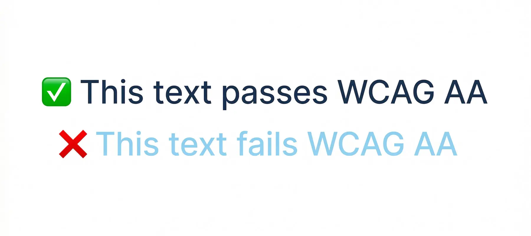
The practical implication: if your brand blue is too light to meet 4.5:1 against white, you need a darker variant for body text usage. This is not a failure of your brand. It’s just a technical requirement that shapes how you deploy the color.
Consistency. A Demand Metric study of 200-plus organizations found that consistent brand presentation correlated with up to 33% higher revenue. The mechanism is straightforward: every time someone encounters your brand, they’re either reinforcing or diluting their mental model of you. Consistent color, consistently applied, builds brand recognition faster. Inconsistent color, across different marketing materials, different product surfaces, different team members’ presentations, fragments that recognition.
The most common consistency failure we see is not a rogue color choice. It’s drift. Someone uses a slightly different shade of blue in a slide deck. Someone uses a stock photo with a color palette that clashes with the brand. Over time, the brand starts to feel incoherent without anyone making a deliberate decision to break it.
The fix is boring but effective: a brand guidelines document with approved hex codes, usage rules, and examples of correct and incorrect application. Give it to every team member who touches brand materials. Revisit it when you hire.
Color selection is one of the earliest branding decisions you make about how your company shows up in the world. The companies that do it well aren’t the ones who hire the most expensive designer. They’re the ones who treat it as a strategic decision, not an aesthetic one. They audit their market, define the emotional territory they want to own, build a system around that decision, and then hold the system consistently.
If you’re in the early stages of building or refining your brand, start with the audit. Open your top three competitors’ websites. Write down their primary colors. Then ask yourself: where is the gap, and what would it mean for your company to own it?
That’s the question that turns a color decision into a brand decision.
If you’re building a brand from scratch or rethinking the one you have, our Brand Identity Design process starts exactly here: positioning first, then a visual system built to own your space in the market.