
Trello has been our project management tool since before we founded susam. Every project we take on lives on a Trello board.
With 19 million users and a recent $425 million acquisition by Atlassian, Trello is one of the most widely used project management tools out there. We use it every day. But the default interface has friction that slows us down. The same flat colors. Labels that only show as color strips on cards, hiding their names unless you click them. A visual sameness that makes boards harder to scan than they need to be.
We’re designers. We notice these things. And when friction shows up in a tool you use every day, it stops being a minor annoyance and becomes a design problem worth solving.
So we built a theme.
The Problem With Default Trello
Trello is a solid project management tool. But its default interface isn’t built for teams managing complex, multi-project workflows across multiple boards. Three things keep slowing us down.
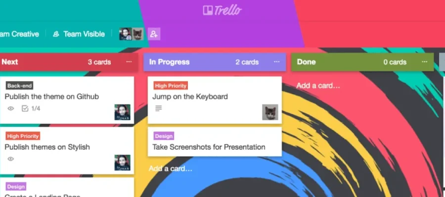
Scanning is slow. Every list header looks identical. When you’re juggling Backlog, To Do, In Progress, Done, and On Hold, your eyes need visual anchors. Default Trello gives you none.
Labels are cryptic. Colored labels are useful in theory. But without visible names, you’re memorizing a color code that changes from board to board. Trello has a keyboard shortcut (;) that toggles label names, but it’s buried and most people never find it. That’s unnecessary cognitive load, and it’s one of the most common complaints in Trello’s community forums.
The interface blends together. Not in a clean, minimal way. In a “nothing guides your attention” way. When you’re working in a tool all day, visual clarity isn’t decoration. It’s function.
What We Built
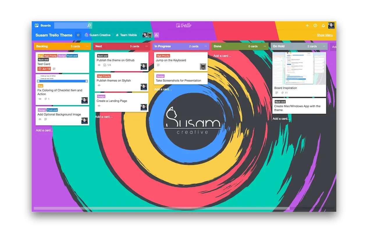
The susam Trello Theme addresses all three problems.
Color-coded list headers. Each list gets a distinct color, making it easier to distinguish between different projects, priorities, and categories at a glance.
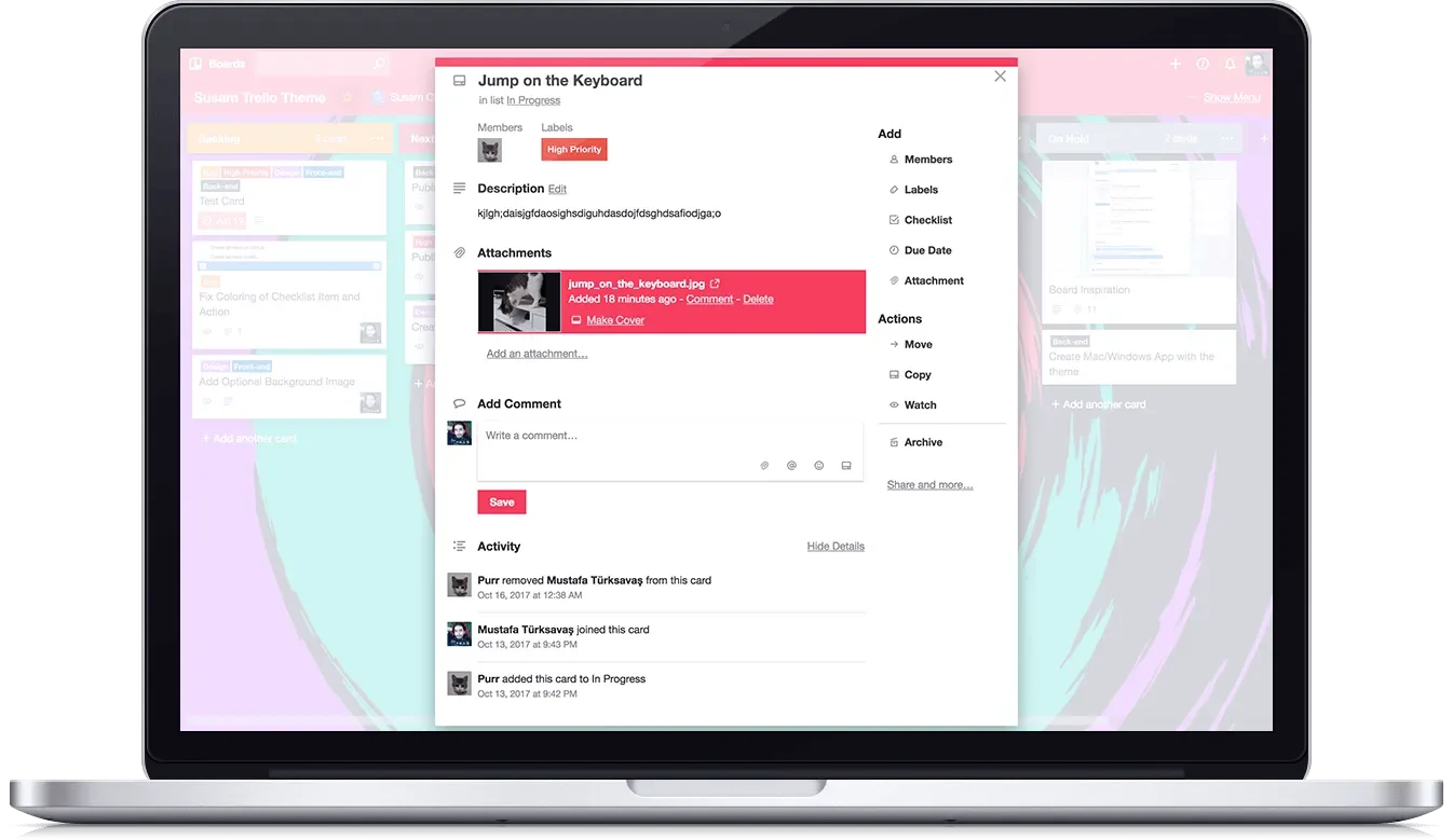
Visible label names. Labels display their text by default, not just as color strips. No more memorizing what each color means.
A cleaner visual hierarchy. A vibrant, intentional design that makes the important information stand out instead of competing for attention.
We built five color variants that change the board header and button colors. Pick the one that works for you.
Download the Theme
The theme runs through Stylus, a browser extension for Chrome, Firefox, and Opera. Install Stylus, pick a color, done.
Blue | Red | Purple | Green | Yellow
Creative Brush Wallpaper
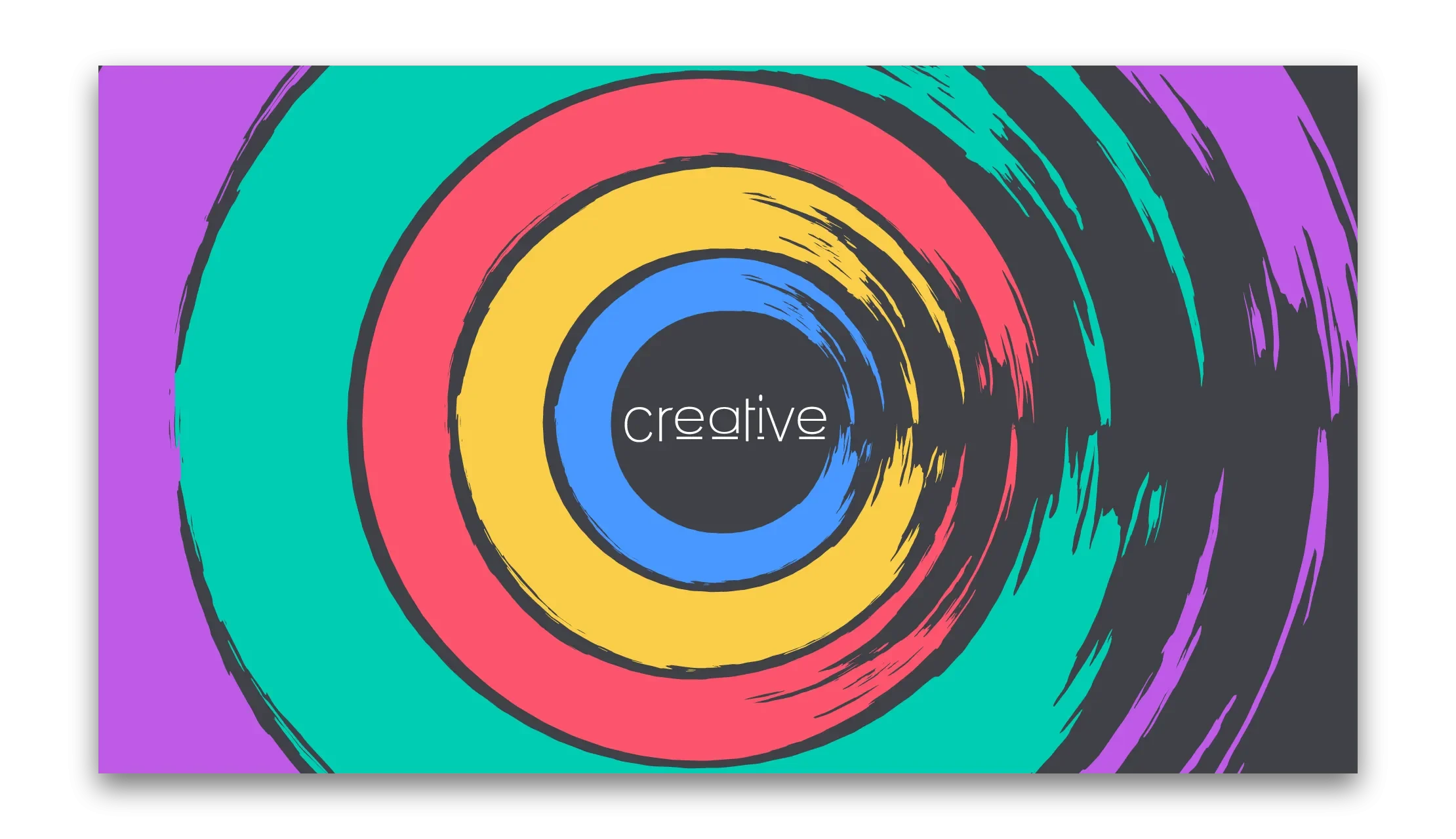
To celebrate the release, we also designed an exclusive wallpaper. We call it “Creative Brush.”
Download Creative Brush Wallpaper
Why We Built It
This isn’t a client project. We use Trello every day and the default experience isn’t good enough. Label visibility alone is one of the most discussed UX issues in Trello’s community. So we fixed it for ourselves, and figured others might want it too.